Case study
Bibliopile
A digital bookshelf for the books you’ve read, listened to or DNF’d, arranged and styled the way you would a real one.
- Role
- Product design, branding and full-stack engineering
- Team
- Solo project
- Timeline
- 2026
The problem
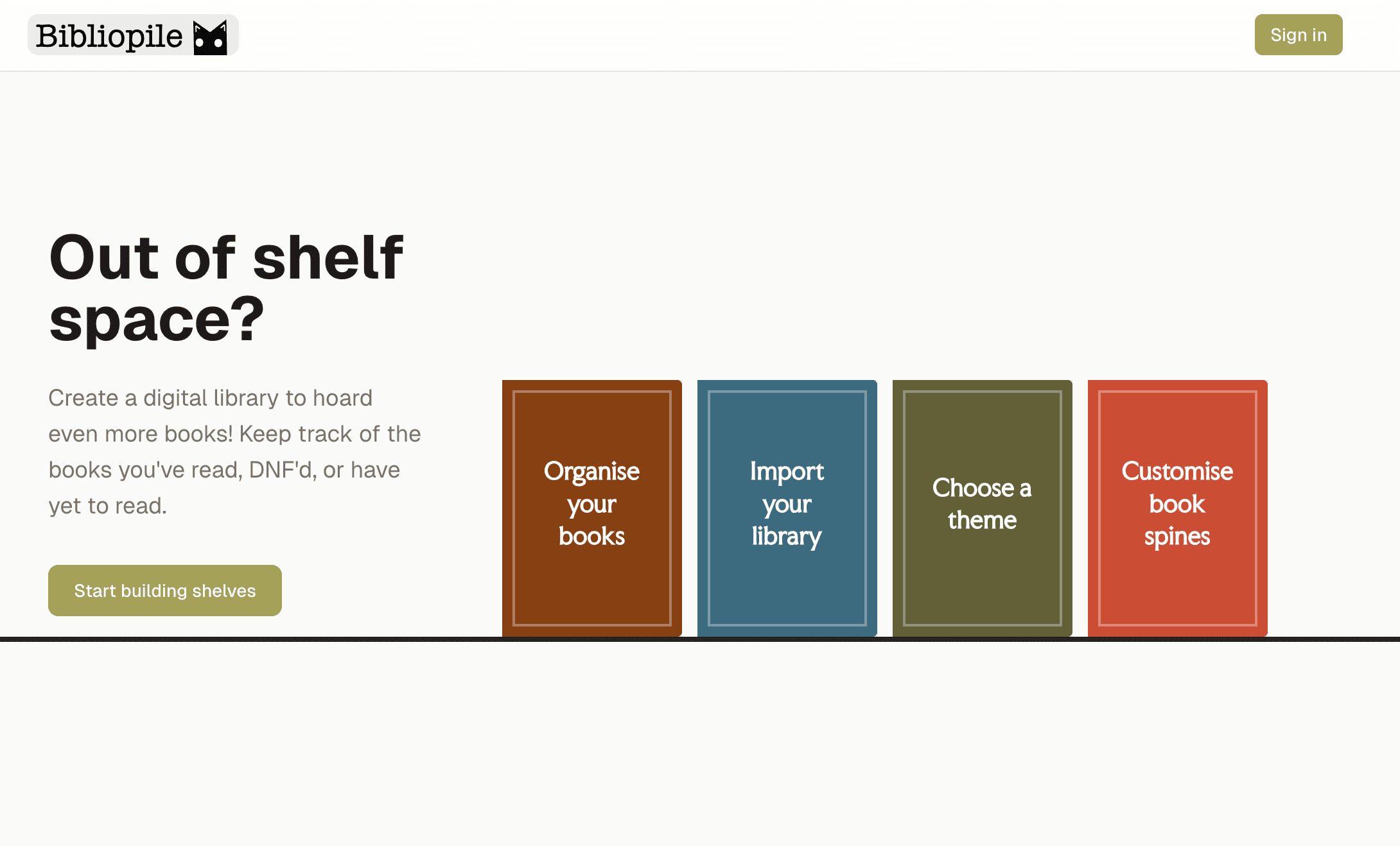
Reading trackers show your books as a grid of covers or a spreadsheet. That works for logging, but you lose the fun of a real bookshelf, like arranging it and watching it grow.
And if you read e-books or listen to audiobooks, those never make it onto a real bookshelf at all.
What I did
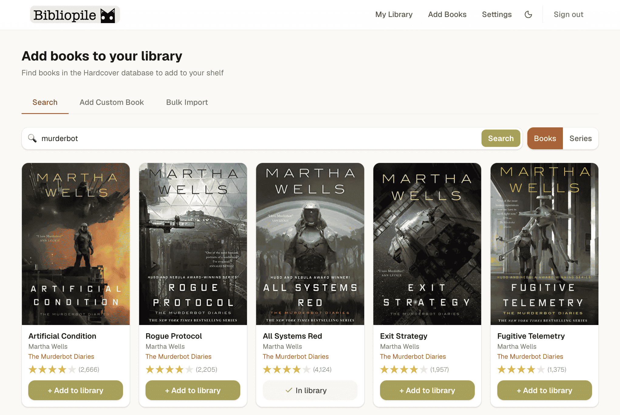
- Came up with the idea, designed the UI and brand, and built the whole app: frontend, Supabase schema and auth, and the Hardcover API integration.
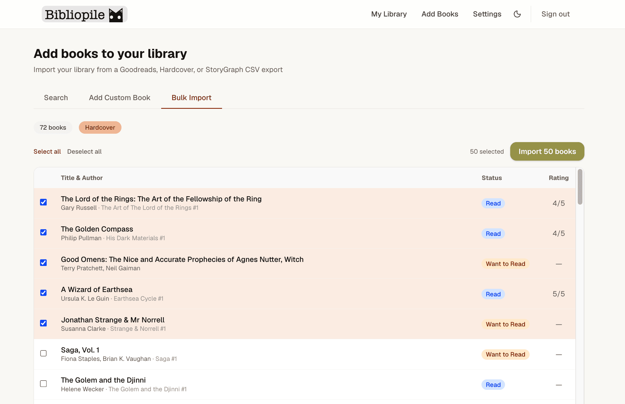
- Built importers for Goodreads, StoryGraph and Hardcover exports, so people can bring their existing library with them.
Key decisions
1.Generating book spines from data
Real spine images don’t exist for most books, and covers squashed into a strip look wrong. Every spine is rendered from the book’s data instead: width comes from page count, height from series and length, and the colours and fonts come from a theme.
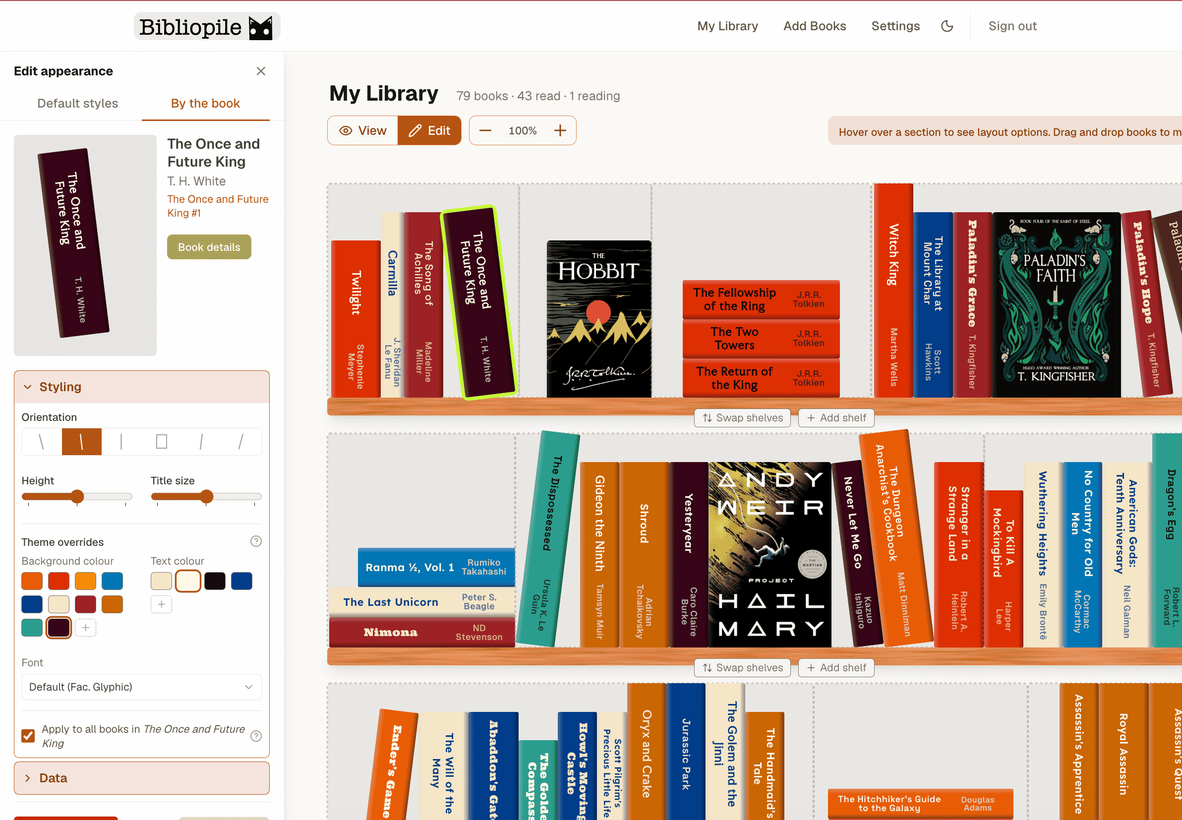
Books can stand, lean, lie flat in a stack, or face out to show their cover. Leaning books use a little trigonometry to work out how much space they need, so a tilted book doesn’t overlap its neighbours.
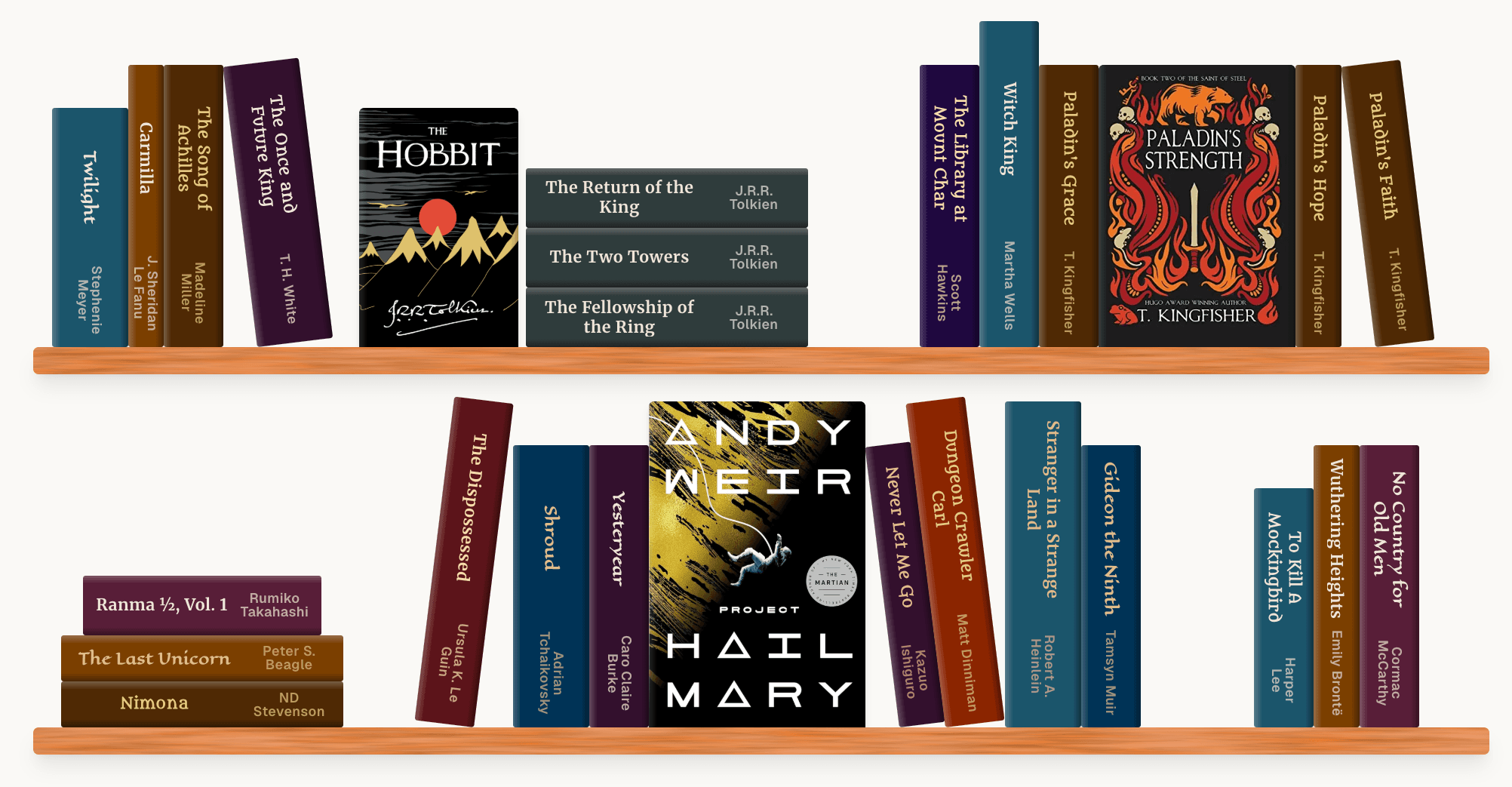
Spine width follows page count. Books can lean, stack or face out, and their neighbours make room for them. Tradeoff: Generated spines are less faithful to the real book, but every book on a shelf looks like part of the same set, and users can override sizes and styles per book.
2.Testable drag and drop
Dragging one or several books within a shelf or between shelves had a lot of edge cases, and the bugs were hard to reproduce by hand.
I separated the decision from the UI: a pure function takes the drag event and current shelves and returns a plan (reorder in place, or move across shelves). The UI applies that plan optimistically and syncs it to the database. As the app grew, I moved shared state from React Context to Zustand stores so drag, filter and display state stopped re-rendering the whole library.
Moving books between shelf sections. The planner works out where they land. The UI updates straight away and saves in the background. Tradeoff: The planner is more code than handling everything in the drag handler, but it’s covered by unit tests and the drag bugs stopped coming back.
3.Readable spine themes
Users can pick spine themes and customise background colours, text colours and fonts. Free choice of colours makes it easy to end up with unreadable spines.
Each theme is checked against a minimum contrast ratio, and text colours are paired with backgrounds that pass it.
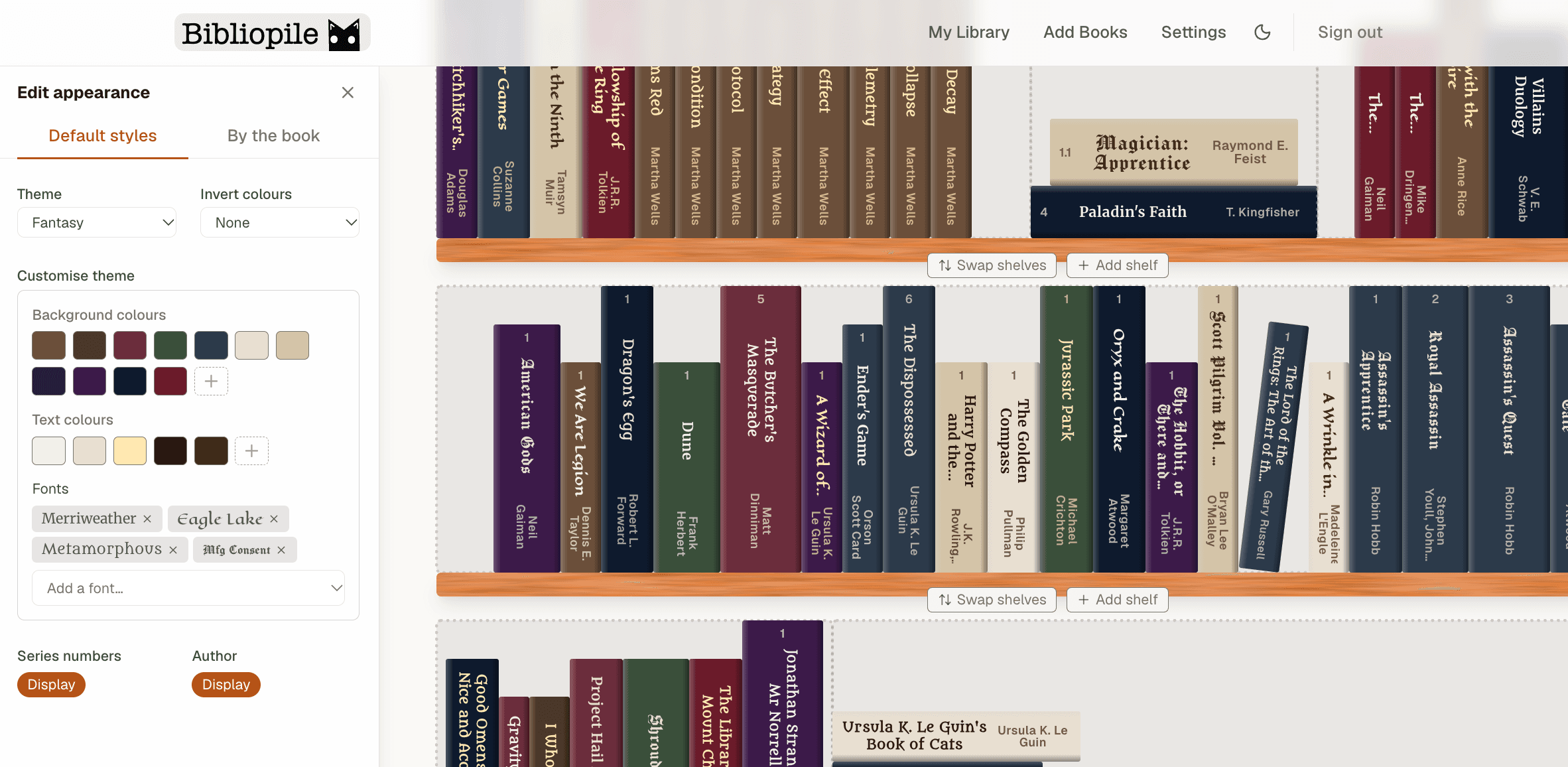
The theme editor. Background and text colours are paired so spine titles stay readable. Tradeoff: I set the floor at 3:1 (WCAG’s large-text level) rather than 4.5:1. Spine titles are short and decorative, and the stricter level ruled out most of the rich, muted colours that make a shelf look like a real one.
Outcome
Bibliopile is live, with public shareable shelves, light and dark themes, and imports from the three main reading trackers.
It was my most UI-heavy project so far. It taught me to move complex interaction logic into small functions that I could test on their own.
What's next
- Making the shelf and editing tools work well on mobile.
- Integrating Hardcover OAuth, so people can connect their Hardcover account directly.
More screens