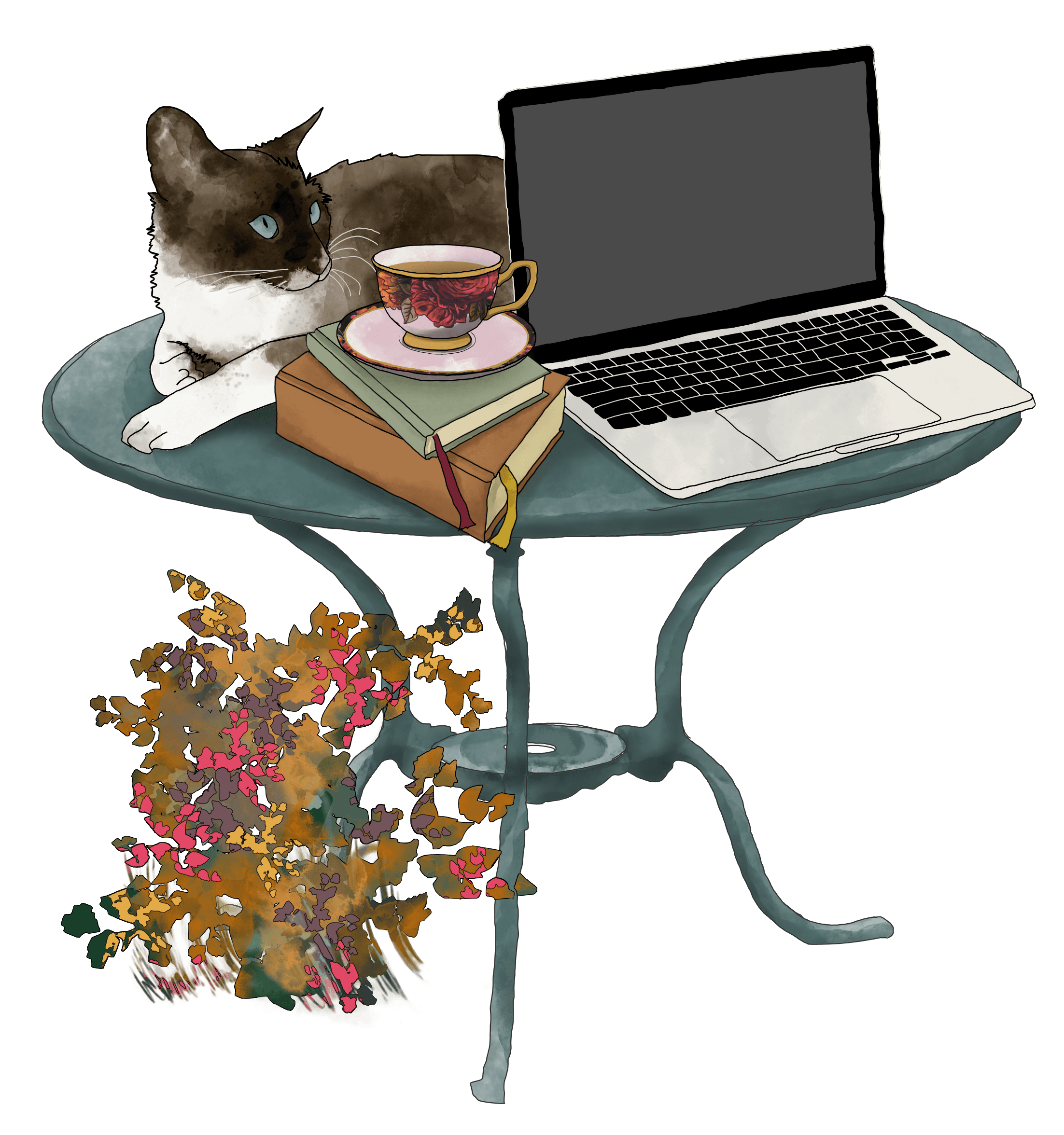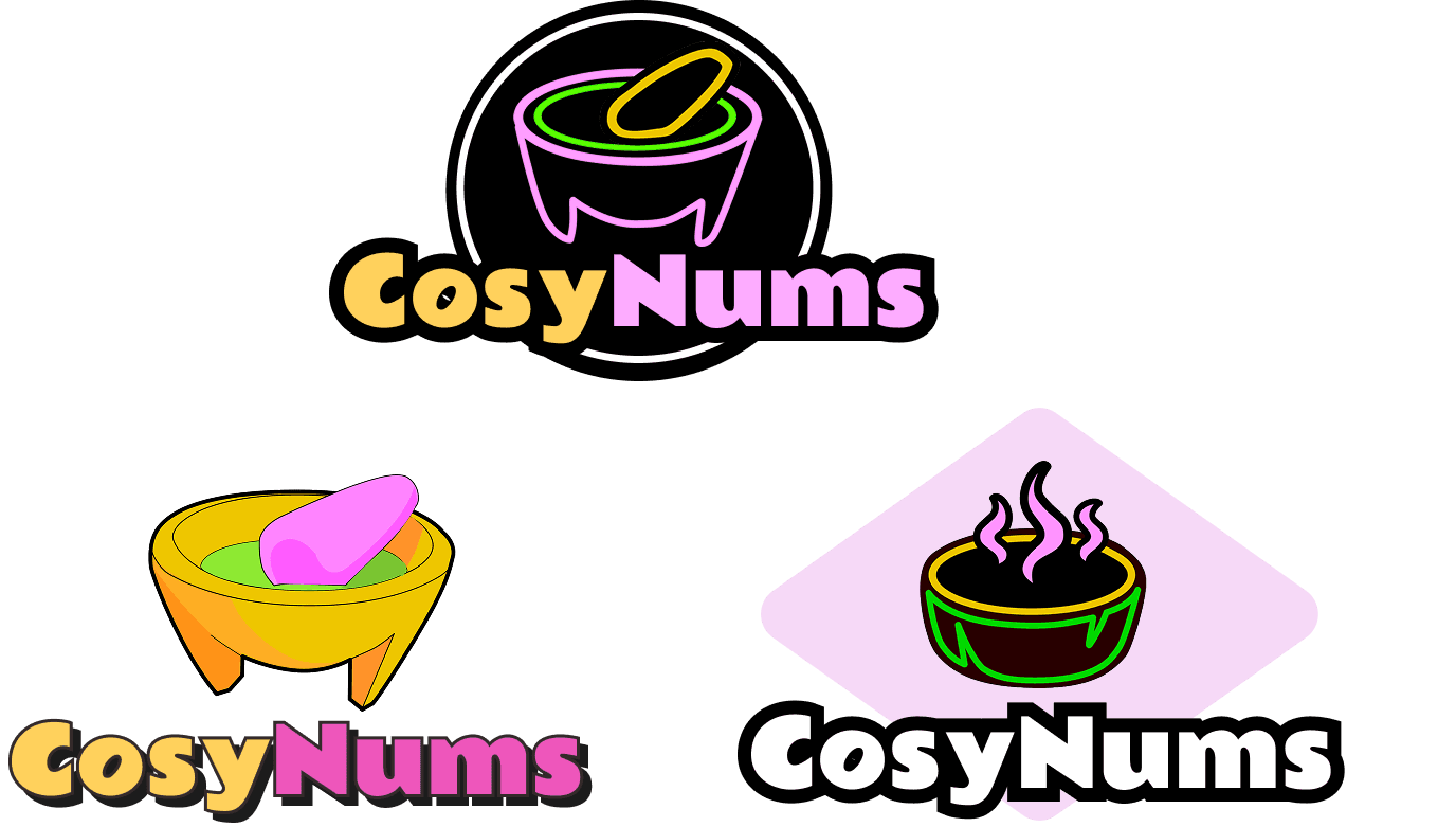

CosyNums logo
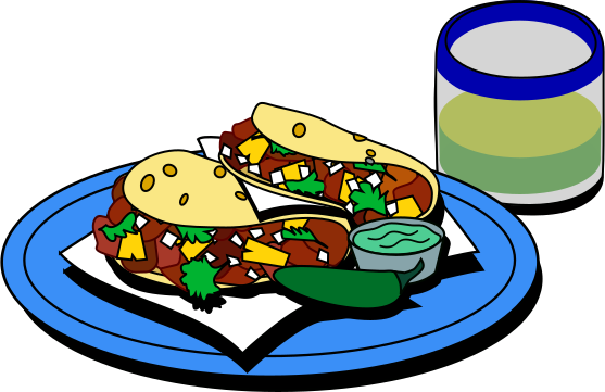
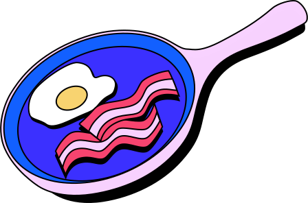
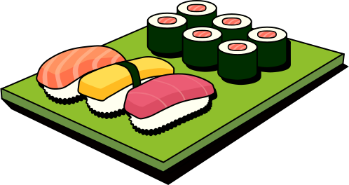
The whole brand has a neobrutalist feel with diner-inspired touches: thick outlines and bold type. I wanted it to feel playful, to live up to the “Cosy” half of the name.
In earlier versions I played around with a more realistic outline and a noodle bowl. The final logo is meant to look like a molcajete fashioned from neon tube lights.
InkscapeAbout the CosyNums app →